The piece explores how an upside-down outline of Washington state gradually became one of the Pacific Northwest’s quietest but most recognizable cultural symbols. What might look, at first glance, like a printing mistake or a misplaced decal has developed into something more meaningful: a subtle marker of regional identity, shared humor, and belonging.
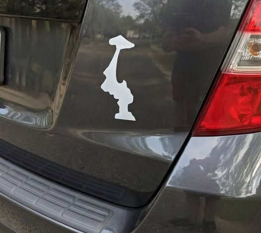
The symbol appears simple. It is just the outline of Washington turned upside down. Yet that small visual reversal has given it a life of its own. In the early 2010s, state-outline decals had already become popular across the country, appearing on car windows, water bottles, laptops, coolers, and notebooks. Many people used them as straightforward signs of home-state pride. Washington residents, however, began giving that familiar format an unexpected twist. By flipping the state upside down, they created something that felt less obvious, less official, and more distinctly local.
Unlike a logo created by a tourism board or a slogan pushed through a marketing campaign, the upside-down Washington outline seems to have spread organically. There was no single widely accepted origin story, no official designer, and no organized effort behind it. Instead, people began noticing it, copying it, asking about it, and placing it on their own belongings. Its popularity grew through repetition and recognition, the way many regional symbols do: not because someone declared it important, but because enough people quietly understood what it meant.
To outsiders, the symbol can be confusing. Someone unfamiliar with it might assume the decal was applied incorrectly or printed the wrong way. That misunderstanding is part of its charm. For locals, recognition becomes a kind of shared wink. Seeing the flipped outline on a bumper or laptop can create an instant sense of familiarity, as if the person displaying it belongs to the same unspoken conversation. The meaning is not loudly announced. It is noticed.
Over time, the symbol gathered several interpretations. Some see it as a joke about Washington’s famously rainy climate, as if the state has been turned upside down by endless gray skies and wet streets. Others read it as a visual nod to the region’s mountain landscapes, especially Mount Rainier and the Cascades, imagining the inverted shape as a playful reference to peaks, slopes, and natural geography. Still others view it as a reflection of the Pacific Northwest’s understated humor: dry, quiet, slightly ironic, and rarely eager to explain itself too much.
That flexibility is part of why the symbol works. It does not need one fixed definition. Its meaning is layered, informal, and shaped by the people who use it. It can be funny, nostalgic, regional, artistic, or simply familiar. It can represent the rain, the mountains, the forests, the ferries, the coffee shops, or the particular personality of a place where pride is often expressed through restraint rather than performance.
In that sense, the upside-down Washington outline fits the region especially well. The Pacific Northwest is often associated with a reserved kind of authenticity. People may feel deep attachment to the landscape, the weather, the cities, and the rhythms of life there, but they do not always express that attachment in loud or polished ways. The flipped outline offers a form of belonging that matches that temperament. It signals connection without shouting. It says, “I understand this place,” without needing a slogan to explain why.
As the symbol spread, it became more than a sticker. It became a quiet badge of shared identity. On a car window, it might suggest that the driver knows the same rain-soaked roads and mountain views. On a laptop, it might hint at someone’s connection to home, even when they are far away. On a water bottle or phone case, it can function as a small reminder of place — not dramatic, but persistent.
The “insider” effect is central to its appeal. Because the symbol is not immediately obvious to everyone, recognizing it becomes part of the experience. Those who understand it feel included in a subtle regional language. Those who do not may ask about it, allowing the meaning to be passed along through conversation rather than advertising. That quiet transmission gives the symbol a sense of authenticity. It feels discovered rather than sold.
For many people, the upside-down Washington outline also evokes the sensory atmosphere of the Pacific Northwest. It brings to mind wet pavement after a long drizzle, evergreen branches heavy with mist, ferry horns in the distance, gray water under gray skies, and the warm refuge of a coffee shop on a cold afternoon. It suggests a place shaped by weather and landscape as much as by city names or borders. The symbol may be minimal, but the feelings attached to it are expansive.
The article emphasizes that the power of the symbol does not come from official meaning. No authority had to define it. No campaign had to explain it. Its significance grew because people repeatedly used it in ways that made sense to them and because others began to recognize that use as meaningful. This is how many cultural symbols are born: slowly, informally, through shared context and quiet repetition.
Ultimately, the upside-down Washington outline shows how subtlety can carry deep identity. It proves that belonging does not always need to be loud, polished, or immediately understood by everyone. Sometimes the strongest symbols are the ones that feel almost accidental, the ones that invite recognition rather than demand attention.
For Washingtonians and many others across the Pacific Northwest, the flipped outline has become exactly that kind of symbol. It is modest, playful, slightly mysterious, and deeply rooted in place. It turns a familiar map into a shared signal, reminding people that regional pride can be quiet and still powerful, understated and still widely understood.